1. How to access the new Analytics
-
Users log in to Syncron Price. Under the Configuration menu, there is a new item called Analytics, which will redirect the user to Syncron Analytics. The old Analytics remains unchanged and is accessible through the Analytics Report Designer.
-
User access is controlled by a special user permission. This screen will be automatically available to all users who have access to the Analytics Report Designer (can be overridden later by the super user).
Analytics user interface will open as a new tab.
Analytics landing page:
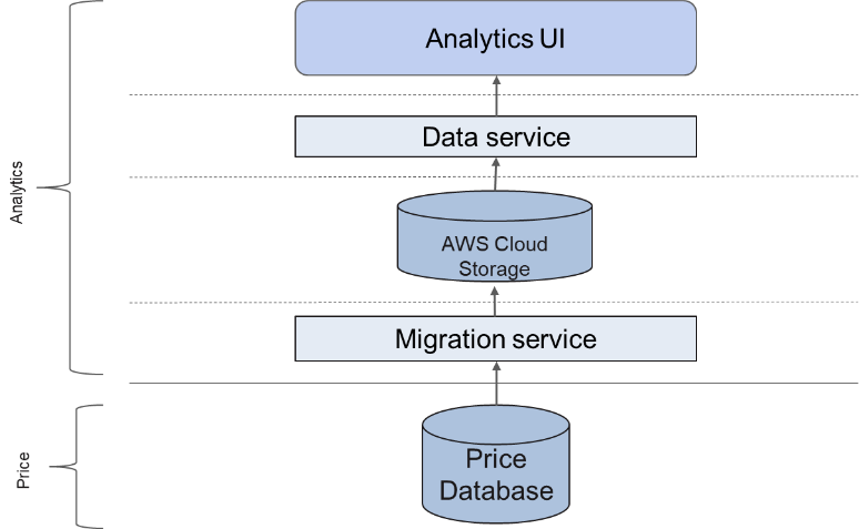
2. Architectural Overview
In order to reduce load from the Syncron Price DB, Analytics now relies on another type of data storage that is optimized for Analytics.
Data is migrated from the Syncron Price database to Amazon Web Services (AWS) Cloud Storage real time without any action from the end user.
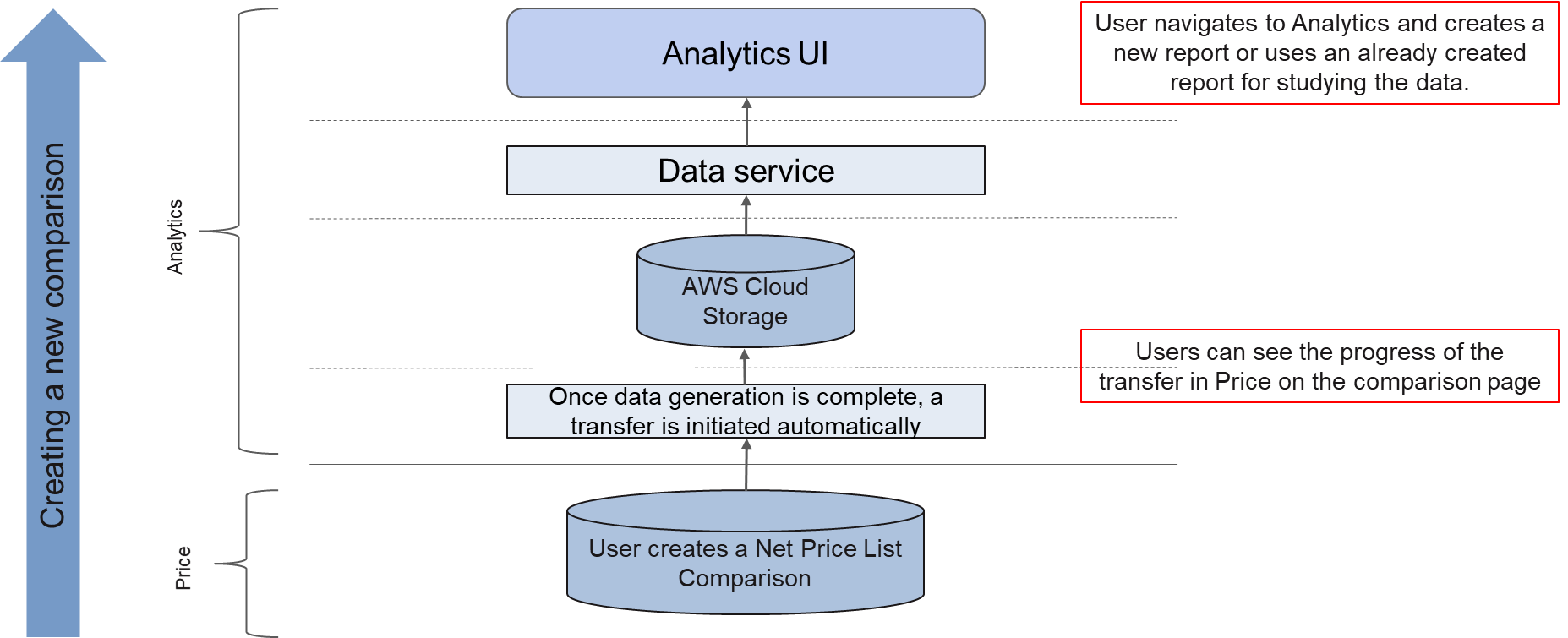
2.1 What this means for a Comparison?
From an end user perspective, things remain unchanged.
The user will create a price comparison (Price List/List Price) in Syncron Price and once that completes, the data will be available in Analytics.
Points to note:
-
From a user perspective, there are no additional steps needed between creating a Comparison and creating a report on it.
-
The data transfers are all automatically triggered real time and completes in a matter of minutes.
-
The Light Price List cube is not used in the new Analytics.
3. The different Tabs
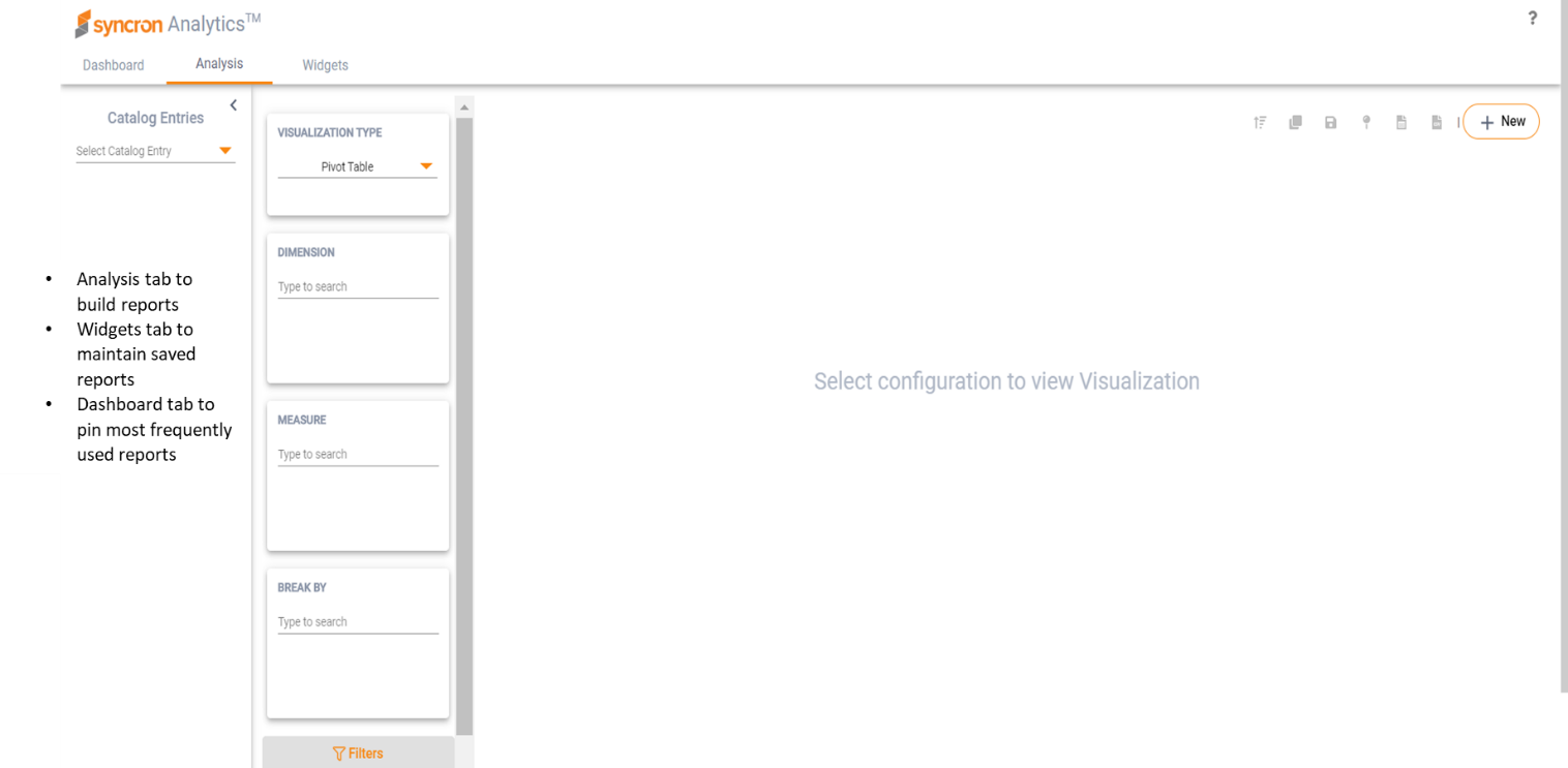
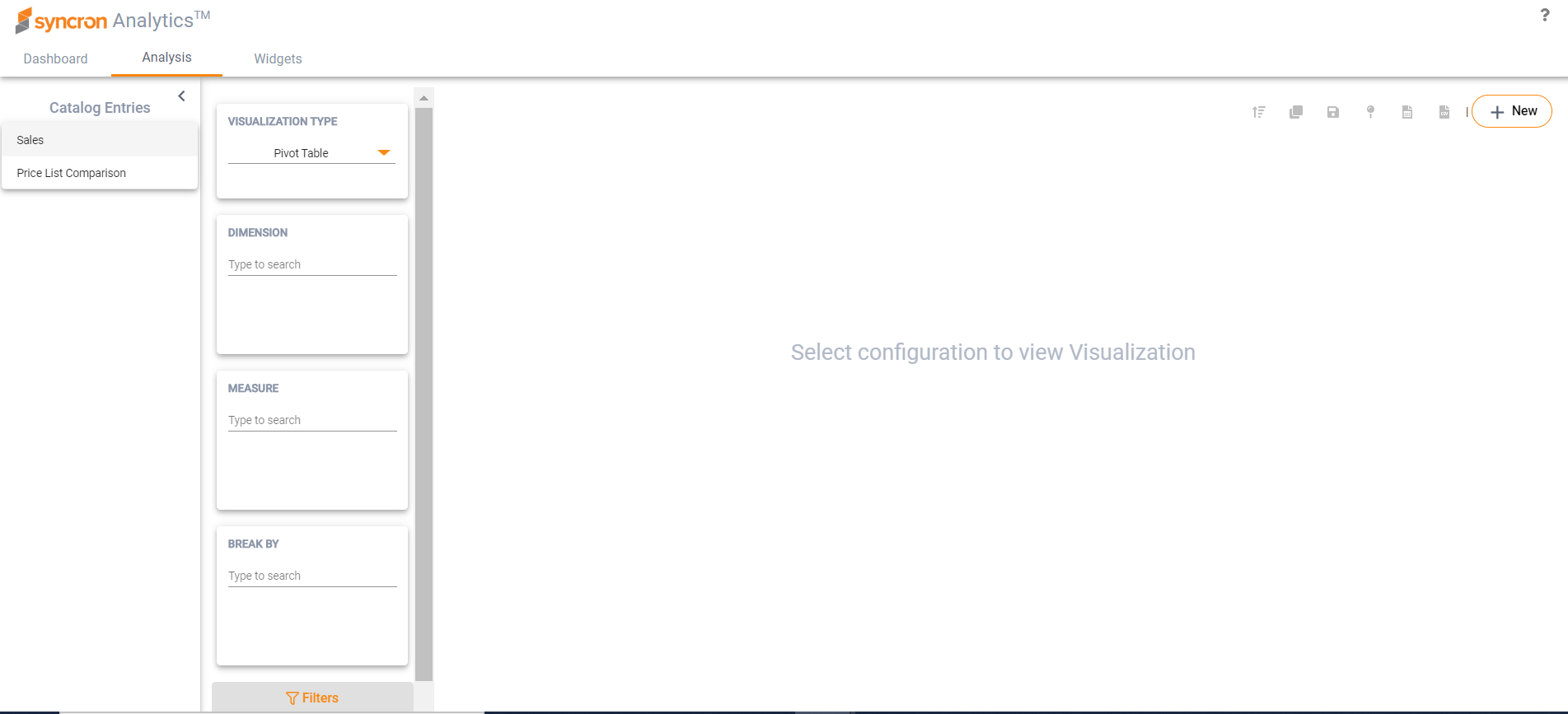
3.1 Analysis
A fixed set of “catalog entries” of Price will be available for analysis – Pricelist Comparison and Sales. A catalog entry is similar to the cube definitions but provides more flexibility, with no fixed hierarchies.
Price List Comparison: The price list comparison cube in Analytics enables the pricing managers to analyze two price lists based on common sales data (current or forecasted sales).
Sales: The sales cube enables pricing managers to analyze and follow up historic sales information (as is) and for example comparing the invoiced net prices with the net prices calculated in Syncron Price (so called price realization analysis). These reports are a great support for the pricing department to understand the impact on revenue and profit on different levels like item groups, product groups, customer types, geographical regions, market etc.
3.1.1 Creating an Analysis
- Users first selects the catalog entry to perform the analysis on
- Next, user must select the “Visualization Type” (default is “Pivot table”)
- User then must add all the required attributes to the analysis configuration – “Dimension”, “Measure”, “Break By”, “Filter”.
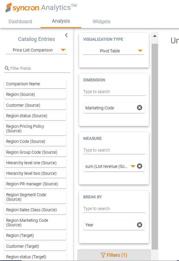
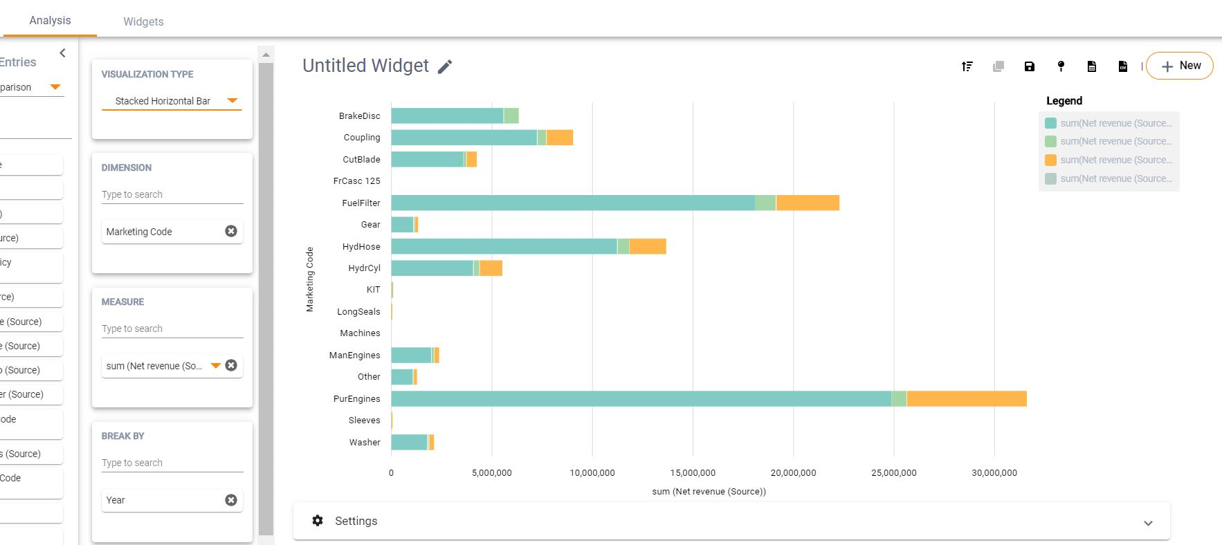
Visualization Type: User must select the type of visualization for the analysis – Pivot table, Bar Horizontal, Bar Vertical, Grouped Vertical Bar, Stacked Vertical Bar, Grouped Horizontal Bar, Stacked Horizontal Bar, Pie Chart, Line Chart, Multi-Line, Scatter Plot
| 1 Dimension | 1 Measure | No Break by | Pie, Vertical Bar, Horizontal Bar, Line, Pivot |
| 1 Dimension | 1 Measure | 1 Break by | Stacked VB, Grouped VB, Stacked HB, Grouped HB, Multi-line, Pivot |
| 1 Dimension | 1+ Measure | No Break by | Stacked VB, Grouped VB, Stacked HB, Grouped HB, Multi-line, Pivot |
| 1 Dimension | 2 Measure | No Break by | Scatter Plot, Stacked VB, Grouped VB, Stacked HB, Grouped HB Multi-line, Pivot |
| 1+ Dimension | 1+ Measure | No Break by | Pivot |
| 1+ Dimension | 1+ Measure | 1 Break by | Pivot |
Dimension: Attribute that the user wants to track some KPIs for (e.g.: If you want to track revenue for marketing codes, add marketing code to Dimension). User can search for multiple attributes of their choice and add it to "Dimension" – this allows for the ability to drilldown the data in the case of Pivot table
Measure: The KPIs that we want to measure and summarize in our analysis (eg: List revenue, Net revenue). Calculation type can be sum, count, max, min, mean, distinct count
Break by: Provides the ability to do a two-dimensional analysis – e.g.: user can build visualizations to view revenue figures for marketing codes in the Dimension and years in the Break by
Filter: Allows you to extract only data that is of significance from a large analysis output
On submitting, results will be populated to the right of the configuration.
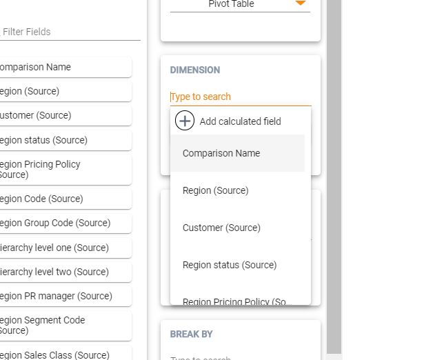
3.1.2 Building Calculated fields for Analysis
To add calculated field to the pivot table or chart, perform the following steps:
-
When selecting Dimensions or Measures, click on the 'Add Calculated
Field' option
-
In the appeared window, assign a name to the newly added field and
configure an expression. When constructing formula, just start typing
the name of the field and Analytics will promptly suggest matching
alternatives.
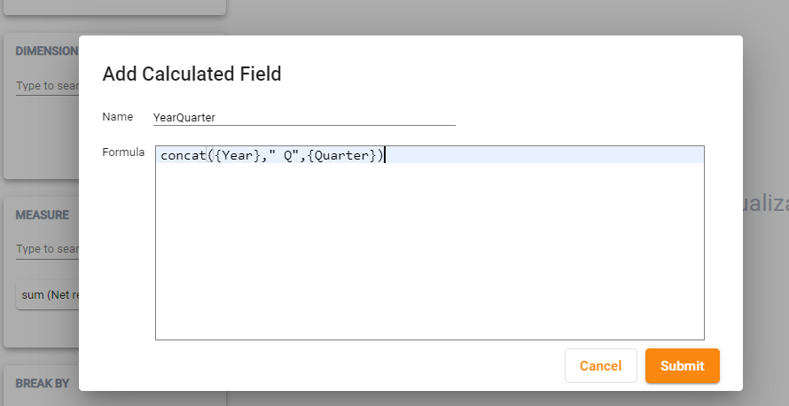
- Click Submit when ready. Now you can use the constructed formula in the same way as any other field. Icon 'f(x)' next to the field in the Value box is an indicator that the field is a calculated field constructed with the help of formula
3.1.3 Configuring Chart Types for Analysis
Configuring visualization chart is very simple:
- Select one of the available Catalogs: Sales or Price Comparison
- Select a chart type of your choice from “Visualization Type”
- Select what field you want to use as a Dimension
- Select what measure you want to get presented as a Measure and how it needs to be aggregated (sum, count, mean, min, max, etc.)
- Optionally, select how you want to break the analysis in your chart - when visualizing data, it is often important to see in the same chart side by side the data for different groups, e.g. for marketing codes or sales regions. In such situations, you can add sales region as dimension and break the bar chart with marketing code or vice versa
- Optionally, select the filter if the data needs to be limited e.g. for a certain year or based on a certain group code
- Press Submit button and enjoy the visual presentation of your data
3.1.4 Naming/Renaming an analysis
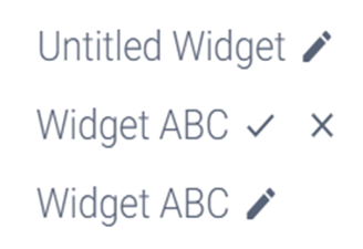
The report will be given a default name – “Untitled Widget” – and can be renamed by the user using the pencil icon.
3.1.5 Saving a widget
In order to save an analysis for future use, it can be saved as a widget. Users can choose to view these at any point in the future, make changes to the configuration or delete the widget from the library.
Data in the saved widget will refresh automatically if Price data is refreshed.

3.1.6 Creating a copy of the widget
Copying a widget is useful if the user wants to create an analysis similar to an already existing one. It can be a change of configuration, or the same configuration with different filtering criteria.

3.1.7 Publishing a widget to the dashboard
Specific widgets which are frequently monitored can be pinned to the dashboard.

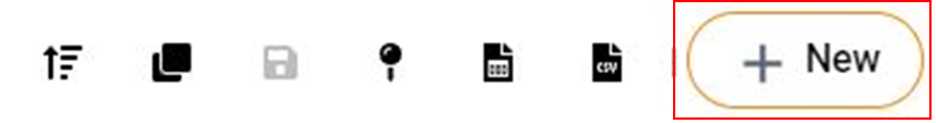
3.1.8 Downloading the results
You can download the results of the analysis in the form of a csv file in case any analysis needs to be done out of the system.

3.1.9 Creating a New Widget
You can create a new widget and build a configuration from scratch by clicking on the “New” icon.
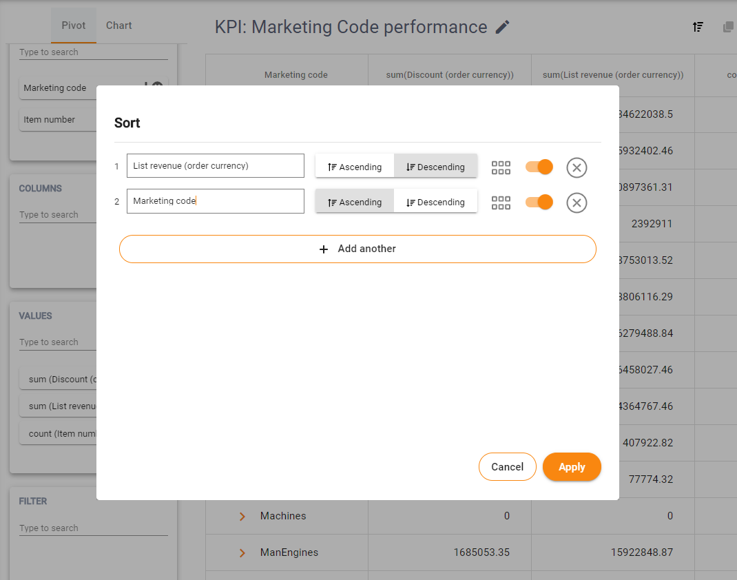
3.1.10 Sorting your results
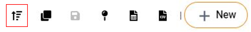
-
Click on the Sort icon in the top bar next to the rest of the icons used for saving widget, exporting, etc.
-
In the appeared dialog configure the desired sorting by choosing the field that you want to sort on as well as the desired sort order: Ascending or Descending.
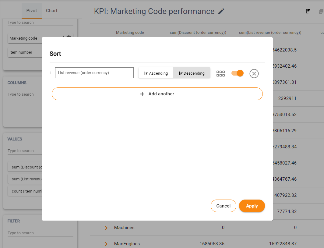
- To add another sorting criteria, click “Add another” button, specify another field and whether you prefer Ascending or Descending order
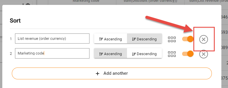
- To delete sorting criteria, click on the 'Delete Sort' icon
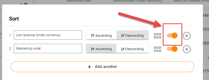
- To temporarily disable sorting criteria, use 'Disable Sort' switch
- Once you have configured sorting, click Apply button. The sorting will be applied to the data within Pivot table.
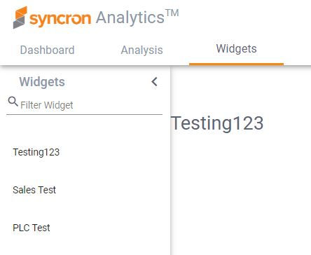
3.2 Widgets
All widgets/analysis that the users have saved over time can be viewed and accessed from the widgets tab.
This is useful for retrieving an old analysis for viewing or publishing purposes.
3.2.1 View
You can view a previously created analysis by selecting a widget from the library visible in the left pane.
3.2.2 Edit
In order to edit a widget, click the pencil icon. It will open up in the analysis tab and the user can make necessary edits.
3.2.3 Delete
Widgets that are no longer needed can be deleted from the library using the trash can icon. These widgets will be removed form the dashboard as well and can no longer be retrieved.
3.3 Dashboard
The Dashboard is used to pin the most frequently used widgets, so that users can access all these in one screen.
3.3.2 Modify the dashboard
User can make changes to the content of the dashboard when in Edit mode. Changes include: * Editing the dashboard title
-
Editing the widget – this opens the widget in the “Analysis” tab along with the widget configuration
Removing widgets no longer needed
Resizing and re-ordering widgets
4. Example
Let’s say that a user wants to study the revenue growth across different quarters in a particular year, for all marketing codes. For the marketing codes where revenues are low, the user wants to go one level down and understand which items are causing this decrease in revenue.
Step 1: Select the attributes for which you want to measure some KPI into the “Dimension” box – in this case, add marketing code as first level and item number as the second level into Dimension.
Step 2: In cases where we want a two-dimensional analysis (like in our example, where we want to study revenue by marketing codes on one dimension and quarterly timeline on the 2nd dimension), add this second dimension to “Break by” box – in this case, add “Name of quarter” into Break by.
Step 3: Add the aggregated measures into the “Measures” box – in this case, add Net revenue (Source) and Net revenue (Target) into the Measures box, and change the aggregate function to sum(). Note 1: Attributes added to “Measures” need to be aggregated by a function. The default function is sum(), but you may change it to count(), min(), max(), mean(), count_distinct() as per your requirement.
Step 4: In case you want to filter your analysis by some attribute, add this to the “Filter”. In this case, let’s study revenue by marketing codes on a quarterly basis for the year 2018, for a specific comparison.
Step 5: Click on “Submit” to obtain the results for your config. For a marketing code with low revenue, if you want to understand which item numbers caused this low revenue, you can drill-down to the next level.